How to get your tray to stand out at Costco
Catch the club members attention
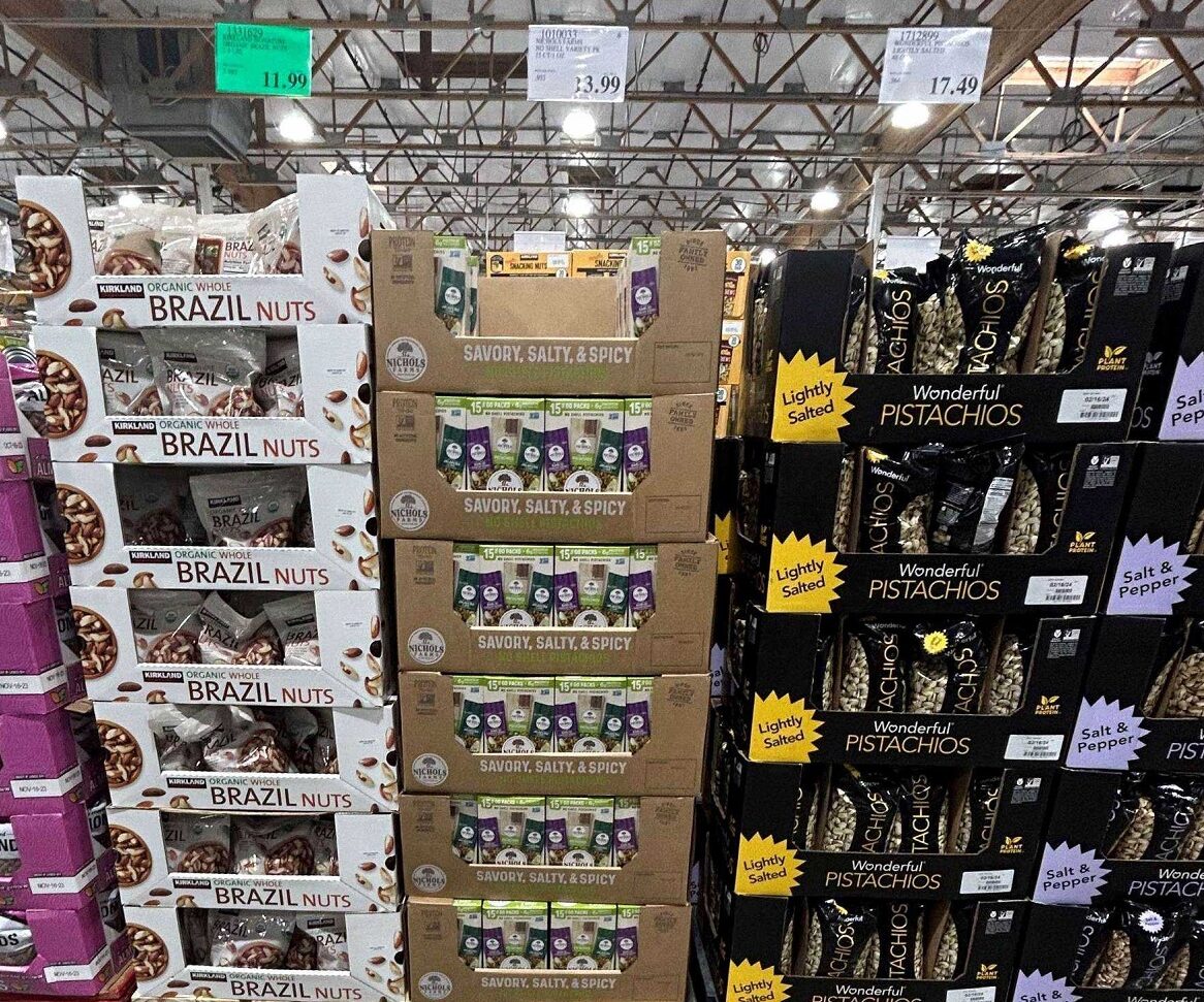
The rule is you have five seconds, from 5′ away to catch the members attention. Looking at this photo both the Kirkland brand & the Wonderful brand stand out, but the tray in the middle fades into the background. The typography is too small and there is too much. Enlarge Savory, Salty & Spicy and deepen the green that reads No Shell Pistachios (you can barely even see this below Savory, Salty & Spicy). In addition, there is so much going on you don’t even realize these are to go packages. The value to the club member is lost.
Product over Brand
Both the Kirkland Brand & the Wonderful brand highlight the product. Brazil Nuts for Kirkland and Pistachios for Wonderful. The brand name is much smaller. On both the tray to the left and the tray to the right a differentiating feature is called out. Organic and Whole for Kirkland & Lightly Salted for Wonderful. This is important! You want to differentiate your product with value to the club member. Your brand is secondary. The tray in the middle calls out the brand with a logo and you can barely see the differentiating factor of No Shell Pistachios.
Material & Print Treatment
Both Kirkland & Wonderful have full litho trays which allow the graphics to pop. The tray in the middle is direct print on Kraft. The tray in the middle is going to be at a lower price point and let’s face it not every brand has a massive packaging budget. However, if you are going to do direct print, make sure your graphics are simple and follow the two guidelines above. Consider a white tray with a bold color direct print. Picture this tray in white, with the product feature/differentiator in the brands green color. The tray would be on point and the retail package would stand out helping to tell the story & communicate the value to the club member. Did you even know these are to go packages!
Walmart Sidekicks - Instore review
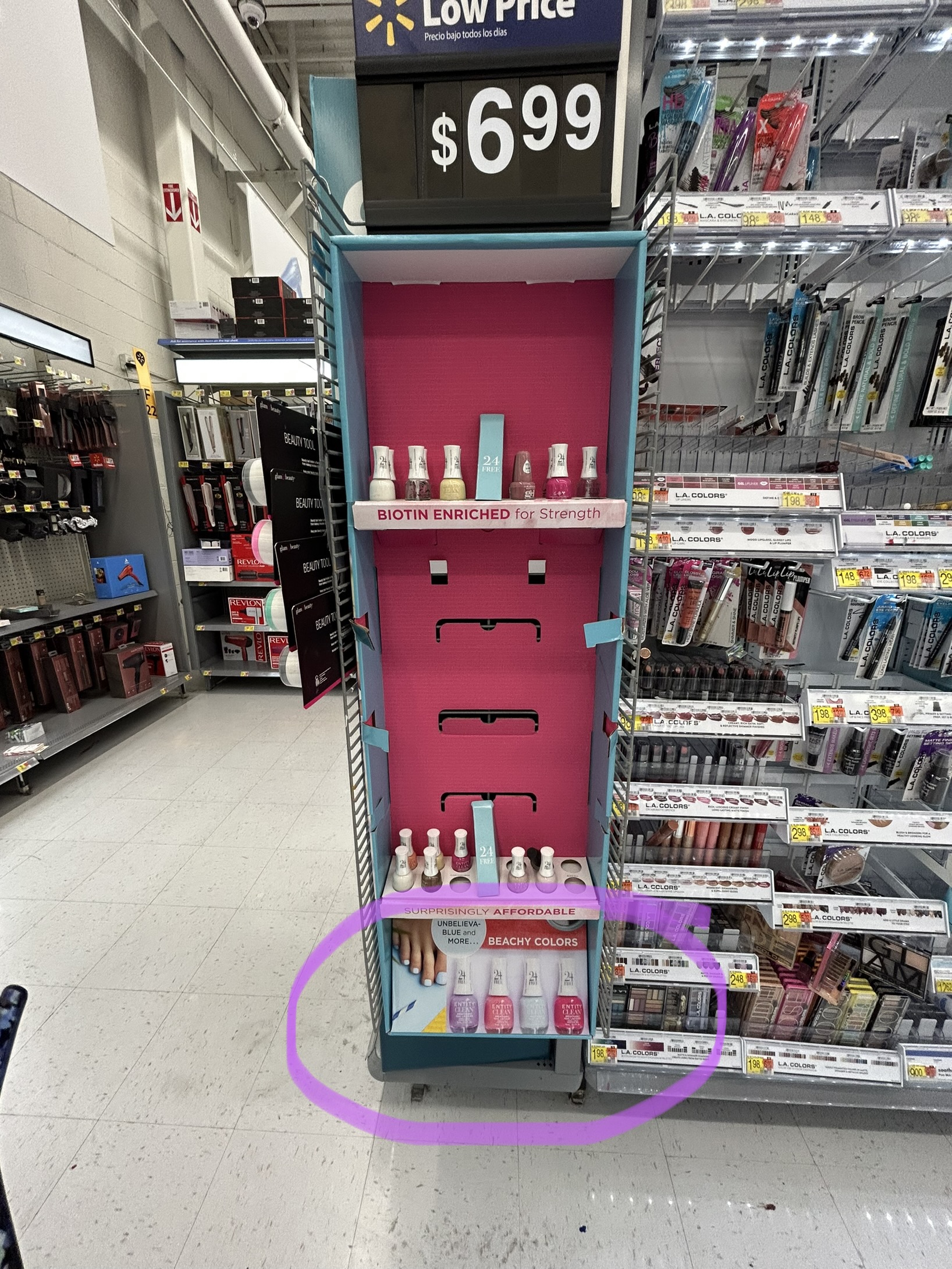
Vibrant back panel of the sidekick & marketing panel creates wow factor for Entity Clean at Walmart
The colors used here really draw the consumer in and do not add significant cost to the project. I also LOVE the use of the filler at the bottom of the display to consume real estate and provide extra marketing billboard space. If you have some extra space this is a perfect fix. No need to create a totally unique structure. Ok but speaking of structure.. let’s be sure the shelf design will hold the weight of the product and will stand up in shipping.
What worked:
Print treatment, color, added creativity to standard structure
What needs improvement: structure, what happened to those middle shelves….
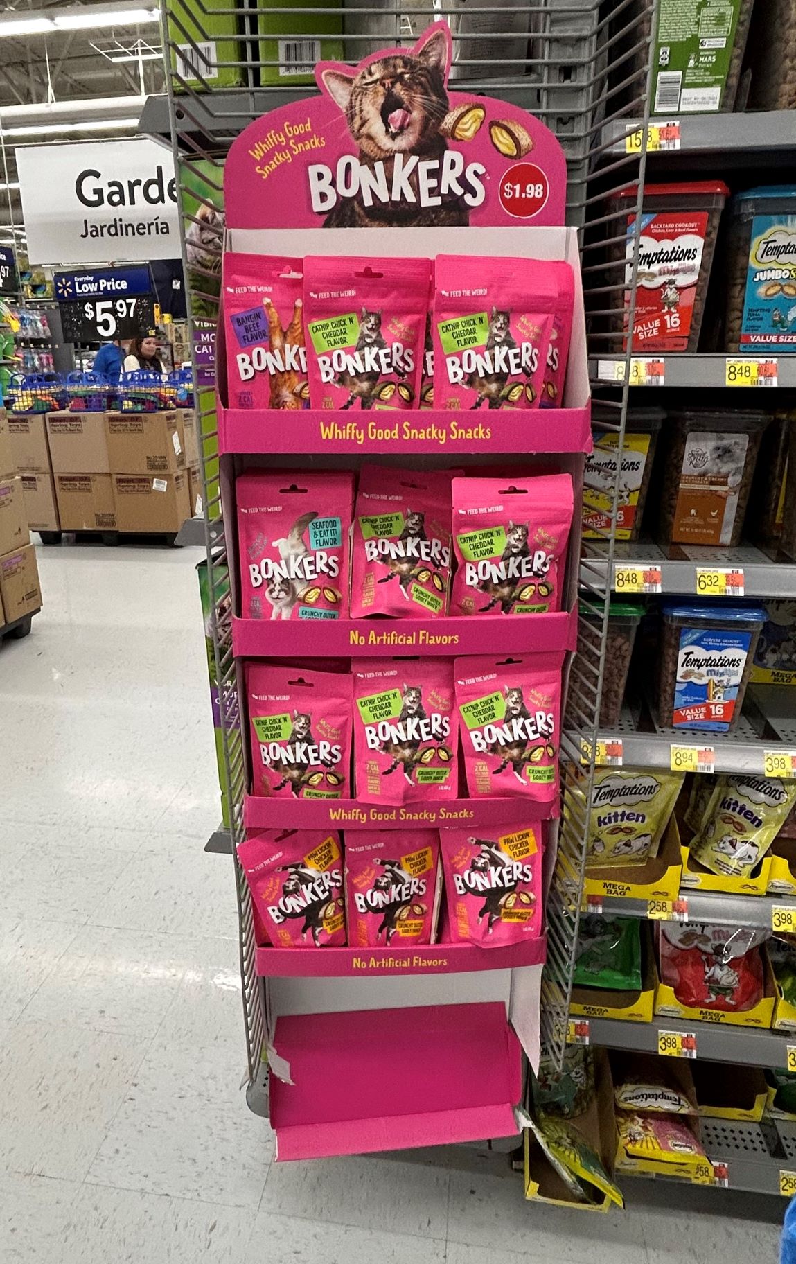
The custom die cut header makes this simple structure pop for Bonkers at Walmart
A basic sidekick gets a serious boost from a die cut header. This is a simple yet effective way to have your brands sidekick stand out from others. I also love the vibrant colors. Take notice of the white back panel. In this instance there is no need to put color there as the packaging covers up the back panel. No need to spend extra dollars. But we do need to talk about that bottom shelf… what happened? As the other shelves are holding up well, I am wondering if this was a case of skimping on shipping fillers to save cost and the bottom shelf gave way during transit. Be sure to talk about shipping fillers before nixing them all together. Often times they are overkill but sometimes they are needed.
What worked:
Die cut header, color
What needs improvement: structure, what happened to that bottom shelf…
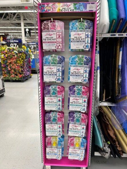
Tulip product packaging does all the work here!
This sidekick is very simple, with one color on the sides and plain white back, simple print on the top and yet it still works to catch the consumers eye. It works because the product packaging tells the story. The front panel of the retail package communicates what the product is, how it works and what color. Elaborate does not always mean more effective!
What worked: simple design with eye catching product packaging
What needs improvement: really nothing, although it would be nice to have the corrugated filler removed at store placement. Just a pet peeve 🙂
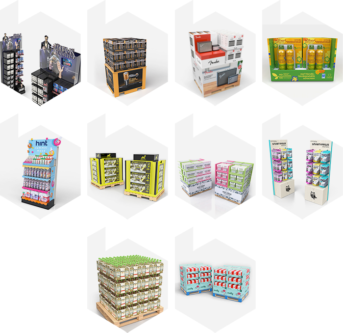
Discover what's needed to design a point of purchase display
Walk any a retail environment and you will notice point of purchase displays.
They are not brand or retailer specific, they are essentially everywhere!
With so many examples, it must be fairly easy to design a successful program.
However, as you look around you will notice some will catch your eye more than others, and some will shop better than others. So where do you begin on the display creation journey. There are a few key pieces of information needed to get started.
Must haves – these are the minimum items to get started:
- The product or products you are looking to display.
- An idea of what purpose the display is going to serve.
- Is this a feature pallet at a club store needing to be three way shoppable
- Is this an annual event pallet at Wal-Mart needing to conform to retailer specific guidelines for the event
- Is this a mass merchandise pallet that needs to attract attention at retail
While any packaging professional will be able to help you with the info above, there are helpful additions which will speed up the design & development process.
Helpful Additions
- Budget (an idea of what you would like to spend)
- How many units you would like to have on the display. You might be
thinking this is a must have, but maybe you want the most amount of product the
pallet can hold. - Ideas on graphics, or features you want to highlight.
- Available footprint at retail for
the display, for example, counter top vs floor stand, vs. sidekick.
The list of helpful additions could go on but if you are working with a professional retail packaging expert, they should guide you with the helpful additions.
Your packaging expert should be familiar with retailer guidelines, and structure and be able to offer print treatment solutions that will be
within your desired spend and still get the look you are after.
While it seems simple on the surface, drilling down is important. You are going to be spending valuable resources on the display and you want it to show up in retail structurally sound, serving its purpose of displaying product and void of any retailer chargebacks for non compliance with requirements.
Want to explore further, reach out! I am happy to share my thoughts and knowledge to help you create and execute an amazing point of purchase display.